}

Design Against Fur

Is it OK to have fur in the home? Photo by Olga Onischenko
I have been sitting on this feature for some time not sure if I should discuss 'Design Against Fur' within the interior's market? However, with the exhibition at London Design Festival 'Design Against Fur' displaying students and emerging designers from around the world tackle the issue of fur in fashion it got me thinking about how we don't really discuss it within the design community. Charlotte stool by Luc Swen; Photo of boy by Alexey Lapin
 I'm not going to preach yes or no but I would love us to have a debate about it. When I was at Livingetc magazine it was a NO WAY policy. However, a  cowhide rug, one of Livingetc's signature looks, was embraced. Fox Fur Double Hammock by Bless Studio; Fashion by Astrid Andersen
Shhh...I did use fur once when I was at Livingetc. I styled the super talented editor at Wallpaper*, Jeremy Langmead's, bed with a black Ralph Lauren fur. Jeremy who is now editor of British Esquire and soon to be online editor for  Mr Porter loved it but my editor gave me a good old slap over the wrist for using it. In 2006 Ralph Lauren actually eliminated fur from all of its apparel and home collections. Armchair 400 designed by Alvar Aalto interpreted by Ilse Crawford; Photo of boys by Philippe Vogelenzang
At British ELLE Decoration fur was much loved and considered chic and glamorous if the design was beautiful, impeccably-made and intelligent. Philippe Starck's polar bear photo by The Selby; Luis JJ Rocking Chair by Antonio Citterio for B&B Italia

Photo by Katelovesme; Bedroom by Jeff Andrews Design

The emerging trend to use fur in the home was obvious at the recent Maison et Objet. Cushions, throws, rugs and the love for stag heads is growing. Are we drawn to it because it provokes our primal imaginations? Is it a way city dwellers find a connection to wildlife and a reminder of survival? Or is it simply the silky soft touch to the natural fur that we are drawn too?  Read the Primitive Living report which discusses our current urge to live the simple life.

So many of us LOVE leather in the home(Check out my leather roundup) so is it a big difference to have a fur rug or cushion?. The Times Newspaper reported leather sofas are the hottest trend in interiors for 2010. 

I really would love to know if you think yay or nay to fur in the home.

The Next Big Thing - Shredding

Four words: Perfection is for wimps. Go on rip it and shred it for a very surprising rock your world kind of result. Shredded headpiece by Confetti System
The Matryoshka table by Rich Brilliant Willing ; Play HIDE & SEEK by Frederique Daubal
Play HIDE & SEEK by Frederique Daubal; Shredded lights by Confetti System

You Must Try This At Home - Black & White Update

 
I'm loving exaggerated so it's in-your-face, powerful, artistic and just cool to look at black & white interiors. Makeup is a great source to find inspiration in creating fun colour palette's in the home.  Camilla Babylon's beauty look used for her runway show at Australian Fashion Week is quirky, bold and fun - a perfect starting point for any designer. Architectural firm i29 have used a dramatic black stripe to add sophisticated drama and depth to a simple white room.
When you use black with white be bold in your approach. Creating large blocks of black with white can be to-die-for spectacular. Take June Buga's t-shirt photo and ask yourself where does your eye instantly focus? Geometric shapes will offer instant decorating success. Don't you love how Studioilse created an awesome headboard by simply painting a half circle in black.
Always think Big, Bold & Brave. Use Lee Myrtle's photo and Chirstian Haas knitted lights for inspiration
If your not so brave or simply don't have any spare cash to update then simple ideas like cutting out shapes from black paper and sticking it to your wall can help your home go from drab to fab. Foot photo by Crazy Doggy and paper raindrops by Sayaka Minemura
What would you rather own if you had to choose between a panda bear or polar bear? For me it would be a panda because they seem warmer, friendlier and cuddlier... Hmmm strangely this weirdly relates into how I wouldn't like to live in a completely white space. Photo of panda make up boy by Ching Liyen; House by Eastern Design Office
 To Laugh Out Loud - Watch This

What Happened This Weekend

We take a quick SnOOp around the globe to see what some creative folk got up to over the weekend.
“Finally back in London, in my room, after travelling from Madrid Fashion Week” says Pelay Diaz from Katelovesme
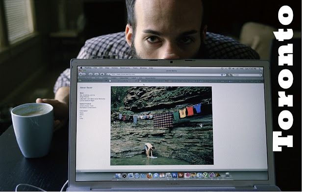
"Oh, hey! Check out my new website. How do you say no to this?!" says photographer Steven Beckly
"I have got so obsessed with drawing mustache's lately I'm putting them on anything I can get my hands onto" says model Aoiyuu
"I did a little impromptu photo-shoot with photographer Steven Beckly," says super talented toy designer, illustrator, and artist Jon Knox
"I've just launched (finally) my online store. You can now shop my latest menswear, womenswear and accessories collection," says French pop fashion designer Jean-Charles de Castelbajac

If you would like to take part in this series, What Happened This Weekend, then send SnOOp an email including picture and your news and we will try to include it next week

IKEA New Baking Book - Homemade is Best


Ikea has just published a collection of baking recipes called Hembakat är Bäst (Homemade Is Best). Sure, knowing how to make Princess Cake is fine and dandy, but the volume is illustrated with some of the most inventive cookbook photography I've ever seen: Styled by Evelina Bratell and photographed by Carl Kleiner, the pristine arrangements of ingredients are so stark and geometric that they verge on the abstract. The good news is that the book is completely free; the bad news is that the only place you can get it is in the kitchen section of Ikea stores -- in Sweden.

New Name - Changes Are Coming!

Follow my blog with bloglovin
Sears Tower sky deck Photo by Charlie Engman
 I'm stepping on out there 
photo by Hetero Topia
and taking the plunge 

Hi everyone... We have a name change... Welcome Home - a guide to modern living has been transformed to SnOOp.  

I have been holding the name and concept of SnOOp close to my heart for sometime. I originally wanted SnOOp to be a free print shelter magazine but as time has passed (two-years) I realised SnOOp belongs online with you. 

Welcome Home - a guide to modern living has always been such a mouthful and was always planned to be a temporary [working title] so I hope you love the new name as much as I do. 

The logo was designed by super talented London design agency Accept & Proceed

We will be moving home within the next couple of months but I wanted you to get use to our new name first.

Have a great weekend 

Amanda xxx 

Atelier Abigal Ahern's New Light Collection

I'm in LOVE with  Abigail Ahern’s  latest lighting collection. I really, really want the birds 

Furoshiki by Lucinda Newton-Dunn & Hennie Hayworth

Photos by Deborah Jaffe Found via Oh Joy

I'm famously guilty in forgetting to take a recyclable bag with me when I go grocery shopping. However all has changed now that I have been introduced to Furoshiki {a traditional Japanese wrapping cloth} by Lucinda Newton-Dunnan & Hennie Hayworth. This amazingly versatile piece of printed cotton textile can be used to wrap and carry almost anything from books and clothes to lunch boxes and watermelons! 

Modern Handmade Dinnerware Trends For Contemporary Table Settings

 My big thing is looking at how we as consumers want value but not at the cost of everything being the same.  I'm in love with everything that feels like it has been made by hand and a has a strong sense of provenance like this Rural outfit by Imke Klee and Looks like paper porcelain plates by Annett Janowiak 
Flick'r star Sayaka Minemura found this dinnerware set at Matsumoto Craft Fair in Japan. I adore the idea of using a familiar, disposable object such as the paper plate and transforming it into a cherished ceramic dinner plate. The uneven edge of the plate adds character and a feeling of one-of-a-kind to what is considered a mass produced product. The humble Wooden fork and spoon is by Ryuji Mitani
Beautiful, natural and informal linens like Lauren Kovin's textiles I believe make a dining table warm and inviting. Great food alone isn't enough. Serving dishes and dinner sets that feel like they're handmade is reminiscent of the love, time, care and skill you have put into making a meal. I'm currently in love with  Pure Deigns sandstone and porcelain collection.
 
Accessorise your table with products that include natural materials like the Balloon & Seasoning Shaker by Masayuki Kurokawa available from K-Shop. Boiled eggs photo by Charlie Engman

Imperfect is the new perfect. Wonky and not ironed is OK. Metropolis bowls by De Intuïtiefabriek. Natural linen trousers available from Etsy shop Blood Orange Thing's.

I am always looking for simplicity, function and beautifully made objects. Homogenous mass market product is a thing of the past. I guess this post is a small stone against the flood of mass manufacturing increasingly dominating design. Photo of linen trousers by Joe Bonomo. Dinner setting photo by Sayaka Minemura

Watch Movie For Extra Inspiration

Rediscovering: The Traditional Use With Leather In The Home

Boiled leather cups by Simon Hasan
Boiled leather bowls by Simon Hasan
Boiled leather stool by Tortie Hoare
Boiled leather vases by Simon Hasan; Boiled leather chair by Tortie Hoare
Floor Lamp by David Ericsson; Stools by Willem Derrider; Pompom pouf by Lisa Hilland Design

Creating lasting memories for your child

New York loft designed by Resolution: 4 Architecture Photos by Martyn Thompson
 
Never under estimate the role your home plays on your children.  Our deepest memories come from the place we grew up. As children, we developed step by small step, and risks were taken because retreat to a safe place was possible. 

"Life begins well. It begins enclosed, protected, all warm in the bosom of the house". 
                                                                                                                             - Gatson Bachelard

The first view from a bedroom window, textures from a small vignette, patterns from a well used sofa or rug and cooking smells from the kitchen stay with us forever. The biggest tip I can give you is to make sure when you are decorating that you allow your ideas to be flexible. Let your home grow-up with your family. 

Four key tips to help create lasting memories for a child's lifetime:

Start introducing ideas for the home to ensure stimulating and relaxed environment for the whole family

Live  make the most of your shared spaces, fun places for everyday life, lounging and learning

Share celebrate your time together in the kitchen, around the table, and with family and friends

Nest bathing and sleeping, appreciate the daily rituals for a calm household environment 

Wrapped Up In Grey Fabric


 Press Play
This is my first video EVER guys. So let me know what you think.... I hope you like. Press the button on the right hand corner to see it full size (although a little blurry when large).

The fashion is by amazingly talented Lauren Kovin
Photos by Jessie McGowan
Music 'Something That's Real' by Quantic Soul Orchrestra

making the most of your home


Creating the perfect home isn't always about being a great home decorator. I was reminded by one reader, Michael Zarvos, when I asked "How Do You Make the most of Your Home", it's about making the most of the living inside. I have added Micheal's words on his picture. Truly beautiful. 

Yes decorating a room or buying a sofa are great additions but its the memories that stick with us. It's cherishing the fun times we have on the sofa or spending time with your kids decorating their room. It's about dancing on the new carpet. Do you agree with Michael?

Thank you so much for your lovely get well comments and links to your lovely blogs and websites.  My sniffles have all gone now. I guess you can see I'm useless when I come down with a little old cold. 


Ceramic Tiles Don't Always Belong On A Wall

Heritage Boy Tile Lamp by Lee Broom; Simple Mold necklaces by On Za Line. Buy here

Preserving Design

Jaeuk Jung designer of The Amber Chair wanted to explore the preservation of a historical object and capturing a moment in time. Jaeuk has used a classic wooden chair and has sealed it in an amber-like polymer. 
Marta Mattsson work contains preserved resin insects. " Nature is a great source of inspiration but so is Pokemon", says Marta. Carly Waito's oil paintings are inspired by natural objects that are curious and beautiful
Natural lacquers, varnish and glazes explore a new shine that captures a watery ciscosity and semi-translucency with a hard a polished exterior. Eclipse 2 by Nick van Woert; Barite, 2009  ~  oil on masonite by Carly Waito
I have always loved cheap sources of wood being transformed into a glossy, elegant material using transparent or semi-transparent lacquer. Rik Stool by Inon Rettig; Particle collection by Jens Praet's; Occasional table by Bleu Nature